
Ultimate Guide to Data Storytelling with Dashboards
A dashboard should help you make a decision fast. If the main point is not clear in about 3 seconds, the dashboard needs work. The best ones do three things in order: set context, show the insight, and point to the next action.
Here’s the short version:
- I start with one business question and one decision
- I build for one audience, not everyone at once
- I put the main takeaway first, usually in the top-left area
- I use simple charts like bars, lines, KPI cards, and waterfalls
- I write titles as conclusions, like Revenue grew 28% YoY
- I add filters and drill-downs only when they help people go deeper
- I test whether users can explain the point and say what they would do next
One example from the article makes the idea clear: a waterfall chart was used to show a $22 million revenue gap and the steps needed to close it. That’s the difference between a report and a story. One shows numbers. The other shows what to do.
What I like most here is the simple rule behind the whole piece: start with the decision, not the data. Once I do that, the rest gets easier - what to include, what to cut, how to lay it out, and which interactions belong.
This guide is about turning dashboards from metric dumps into tools people can use.
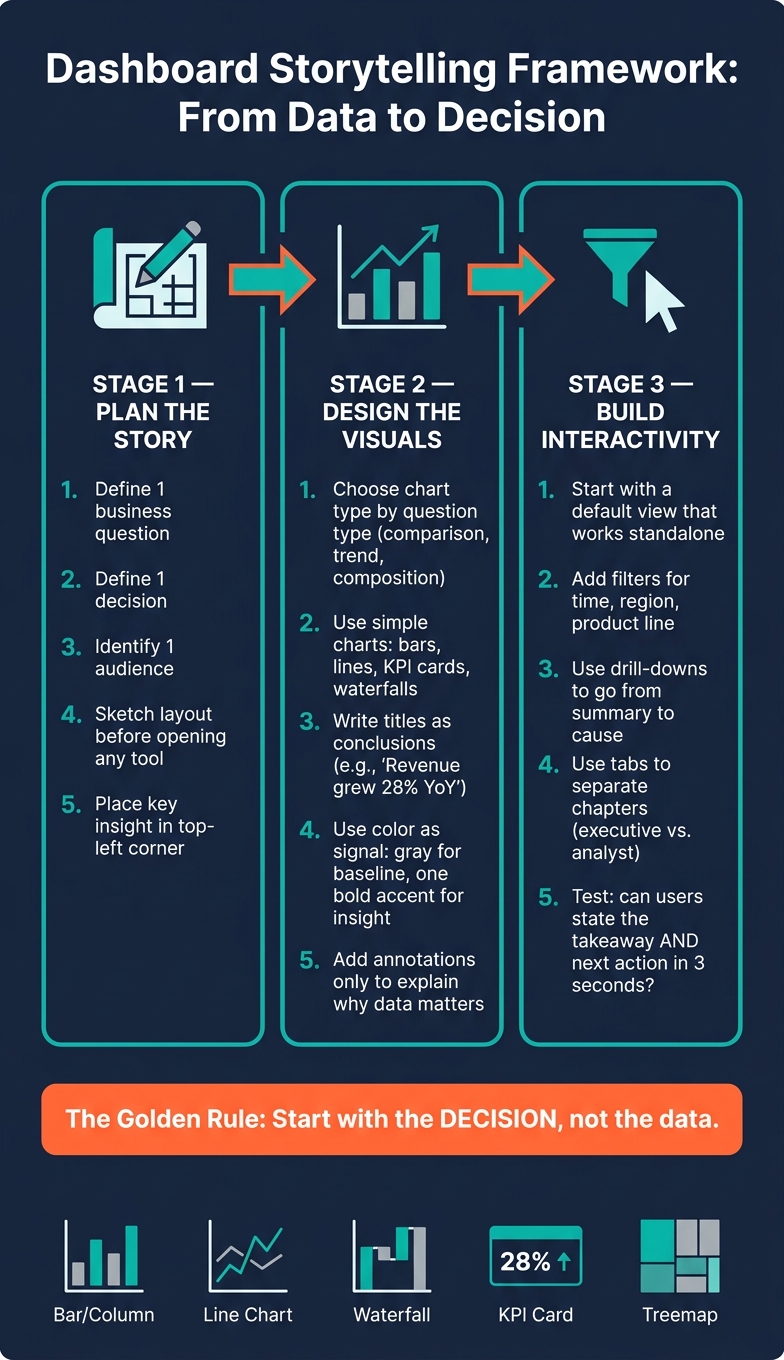
Dashboard Storytelling Framework: From Data to Decision
Transform dashboard insights into an action-inspiring story
sbb-itb-61a6e59
Plan the Story Before You Build the Dashboard
Plan the story before you open a BI tool. That simple habit turns context, insight, and action into one clear dashboard scope. Once the story is set, you can scope the dashboard around one decision.
Start with the Business Question and Decision
Before you touch the tool, write down the single most important question the dashboard needs to answer. Then write down the decision that should follow from that answer.
Those two points shape everything else:
- Which metrics belong
- How much detail to show
- What to cut
A useful habit is to write one sentence that includes the takeaway, the action needed, and the review date. That sentence helps shape the title, the lead visual, and the next step. The goal is to show the insight, not the process. Stakeholders need to see what the data means, not how you built it.
Match the Dashboard to Your Audience
That decision also sets the right level of detail, language, and interaction. Your audience tells you whether the dashboard should explain, monitor, or support deeper analysis.
Use the audience’s language and the metrics they already know. Skip technical jargon when the audience isn’t technical. Stick to the terms and measures that team uses every day. The same data can need a different frame depending on who’s looking at it.
Executives usually need outcome-focused views with little interaction. Analysts usually need filters and drill-downs. Trying to serve both groups in one dashboard often leaves both with something awkward and hard to use.
Sketch a Layout and Keep the Scope Tight
Once the scope is set, sketch the page so the main insight appears first. Do it on paper before you open the software. Put the most important KPI or summary chart in the top-left corner, since users tend to scan from top-left to bottom-right. The layout should support the takeaway, not fight for attention. If something doesn’t directly support the one-sentence takeaway, cut it.
The layout pattern should match the audience and the difficulty of the story:
| Layout Pattern | Target Audience | Pros | Cons | Best-Fit Scenario |
|---|---|---|---|---|
| Headline-Body-Details | General Stakeholders | Logical flow; summary to root cause | Cluttered if details are too granular | Standard business performance reviews |
| Single-Screen Executive Summary | Busy Executives | Fast, high-level summary; 3–5 core KPIs | Weak for root-cause analysis | Monthly or quarterly leadership briefings |
| Multi-Page Narrative Story | Analysts & Product Managers | Deep-dive exploration; step-by-step chapters | Big picture can get lost across pages | Complex investigations or trend analysis |
The same planning discipline should guide the actual build, too. A short story brief can help lock in the audience, takeaway, charts, and annotations so the story stays tight from concept to build.
Design Visuals That Support the Narrative
Once the story and audience are clear, visuals should make the main point easy to see. That means the chart type, layout, color, and annotations all need to push in the same direction.
Choose Chart Types Based on the Question
Start with the question you need to answer: comparison, relationship, distribution, or composition. Then pick the chart that makes that answer easy to spot and helps the reader see what to do next.
Use the simplest chart that gets the job done.
| Chart Type | Ideal Use Case | Storytelling Strength | Common Pitfalls |
|---|---|---|---|
| Bar/Column | Categorical comparisons | Maximum precision; easy to rank | Messy with more than 10 categories; misleading if the axis isn't at zero |
| Line Chart | Trends over time | Shows velocity and direction | Clutter with more than 7 lines; dual y-axes can confuse |
| Treemap | Hierarchical part-to-whole | Shows complex nesting and depth | Rectangles are hard to compare accurately |
| Waterfall | Financial movement | Shows how a number moves from start to finish | Can become overly complex if too many steps are included |
| KPI Card | Status/Single metric | Instant clarity for high-level stats | Lacks context; doesn't show distribution or trends |
A few simple rules help a lot:
- Start bar chart axes at zero.
- Use horizontal bars when category labels are long.
- Use direct labels instead of legends.
Use Layout, Color, and Whitespace to Direct Attention
Layout should guide the eye from the headline to the proof and then to the action. Put the lead visual where people will see it first. Keep related visuals near each other so the connection is easy to make. Leave whitespace between sections because it lowers cognitive load and helps key elements stand out.
Color should act like a signal, not decoration. A neutral gray works well for baseline data, and one bold accent color can call out the insight that matters most. Red can show underperformance, and green can show positive results, but color alone isn't enough. Add labels or patterns so the message is still clear for accessibility. If you want a safer choice, orange and blue are easier to read than red and green for many people.
Add Captions and Annotations That Explain Why the Data Matters
When the chart is set, titles and annotations should say the insight plainly. Write the title as the takeaway, not just the topic. "Revenue grew 28% YoY" tells the reader the point right away. "Revenue Report" leaves them to figure it out on their own. That one shift helps the message land faster.
Use annotations only when they explain the reason behind a change the audience needs to act on. Captions should tie together the outcome, the change, and the driver in one sentence.
Build Interactive Dashboards Without Losing the Story
Once the static story is clear, add interaction only where the page itself can't do the job. Interactivity should reveal a new insight or show the next step, not distract people with extra clicks.
Use Filters, Drilldowns, and Navigation with a Clear Purpose
Start with a default view that makes sense on its own. Then use interaction to help people go deeper.
Filters for time, region, or product line are usually the easiest place to start. They let users narrow the story to their slice of the business without changing the main narrative for everyone else. Drill-downs take someone from a summary metric to the reason behind it. Tabs are best when the dashboard has separate chapters, like an executive summary and a deeper operational view, so users can move through the analysis in a logical order.
There's a practical side to this too: too many controls can slow the dashboard down. Pre-aggregating data and limiting the number of active filters helps keep load times short. If a filter takes more than 3 seconds to update, people stop seeing it as interactive.
Use these controls to extend the story, not send it off course.
Apply Storytelling Patterns in BI Tools
Bookmarks, buttons, and tabs can help you build a guided sequence for executive reporting. Done well, they follow the same logic as the rest of the dashboard: move the reader from what happened to what to do next. That way, the flow stays intact instead of getting broken by the interface.
Test Whether Users Understand the Story and Next Action
After you pick the controls, test whether users can spot the takeaway without help. Show them the dashboard without coaching. Ask what they think it says first, and what action they would take next.
Pay close attention to moments where users pause or misread a control. Interaction logs can also show which controls people use and which ones they ignore. If a drill-down or secondary filter never gets clicked, cutting it can reduce clutter and keep attention on what matters most.
Use this table to match each control to its job in the story.
| Interaction Type | Storytelling Benefit | User Complexity | Recommended Usage Scenario |
|---|---|---|---|
| Filters/Slicers | Narrows the story to a user's segment without changing the structure | Low | Comparing performance across regions or product lines |
| Drill-down | Moves from a summary metric to the cause or granular detail | Medium | Investigating why a specific KPI dropped in a given month |
| Hover/Tooltips | Adds context and exact values without cluttering the main visual | Low | Showing period-over-period change percentages on a trend line |
| Navigation/Tabs | Separates a complex story into distinct chapters | Low | Separating an executive summary from deep-dive operational analytics |
| Bookmarks/Buttons | Creates a guided narrative arc for presentations | Low | Executive reporting where a specific story order is required |
Apply Dashboard Storytelling in Real Data Work
Why Dashboard Storytelling Matters for Data, Analytics, and AI Roles
After planning the dashboard, shaping the layout, and adding interactivity, one job still matters most: turning the dashboard into something people can act on. Dashboard storytelling is the step that turns technical output into business action. It links the data work to the decision it needs to support.
For data engineers, analytics engineers, and AI practitioners, raw SQL results and model outputs need to become a clear story. That story should show where growth is coming from, which actions can move the business forward, and what risks come with doing nothing. Stakeholders care about the result. They don’t need a play-by-play of the workflow.
How DataExpert.io Academy Supports Hands-On Practice

This matters most when technical work has to land as a business story people can use. DataExpert.io Academy offers hands-on boot camps and subscriptions in data engineering, analytics engineering, and AI engineering. Programs include capstone projects, Databricks, Snowflake, AWS, guest speakers, and a learning community with a strong focus on business communication.
Conclusion: Key Rules for Better Dashboard Stories
A dashboard should make the next step plain. Start with the business decision. Design for the audience in front of you. Keep each visual tied to one question. Add interactivity only when it helps users dig deeper.
Used this way, dashboards become decision tools instead of report dumps.
FAQs
How do I choose the right dashboard for my audience?
Start with the decision your audience needs to make, not the data itself. That shift changes everything. A dashboard should help people decide what to do next, not force them to dig through charts and figure it out on their own.
Shape the dashboard around the reader’s level of expertise. Executives usually want the big picture: high-level summaries, KPIs, and clear takeaways they can scan in seconds. Analysts, on the other hand, often need more detail, along with drill-downs that let them dig into the numbers and spot what’s driving the story.
Then match each visual to the question you’re trying to answer. Keep it simple:
- Bar charts for comparisons
- Line charts for trends
- Scatter plots for relationships
- Histograms or box plots for distributions
- Treemaps or stacked bar charts for part-to-whole views
- KPI cards for one critical metric
Pick the chart that fits the job. If the viewer has to stop and decode the visual, the dashboard is already doing too much work.
When should I add filters or drill-downs?
Add filters and drill-downs when users need to move from a broad overview to a specific answer they can act on. Tie them to the top three or four questions your audience asks most often.
They should give people more context and help explain why one data point looks different from the rest. Keep the path simple, and make each drill-down feel like the next layer of detail, not a detour into a separate report.
What makes a dashboard a story instead of a report?
A dashboard turns into a story when it does more than display numbers. It answers questions that help people make specific decisions.
Unlike a standard report built for monitoring, a data story walks the audience through a clear narrative: context, insight, and action. It uses selected visuals, notes, and a deliberate sequence to guide viewers toward a conclusion.