
Interpreting AutoML Results with SHAP
Good model scores do not tell me why a model made a decision. SHAP does.
If I use AutoML, I still need to check which features moved a prediction up or down, which model type needs which SHAP explainer, and where SHAP can mislead me. That matters even more in U.S. use cases like lending, healthcare, and risk scoring, where one prediction can affect people in a direct way.
Here’s the short version:
- AutoML picks and trains models.
- SHAP explains predictions at the feature level.
- Global SHAP plots show which features matter most across a test set.
- Local SHAP plots show why one record got one result.
TreeExplainerfits tree models like XGBoost, LightGBM, CatBoost, and Random Forest.KernelExplainerfits black-box models, but it can cost more to run.- For classification, I usually explain
predict_proba, not just class labels. - SHAP shows model attribution, not cause-and-effect.
- A model can post strong AUC or accuracy and still rely on risky or biased signals.
A few points stand out from the article:
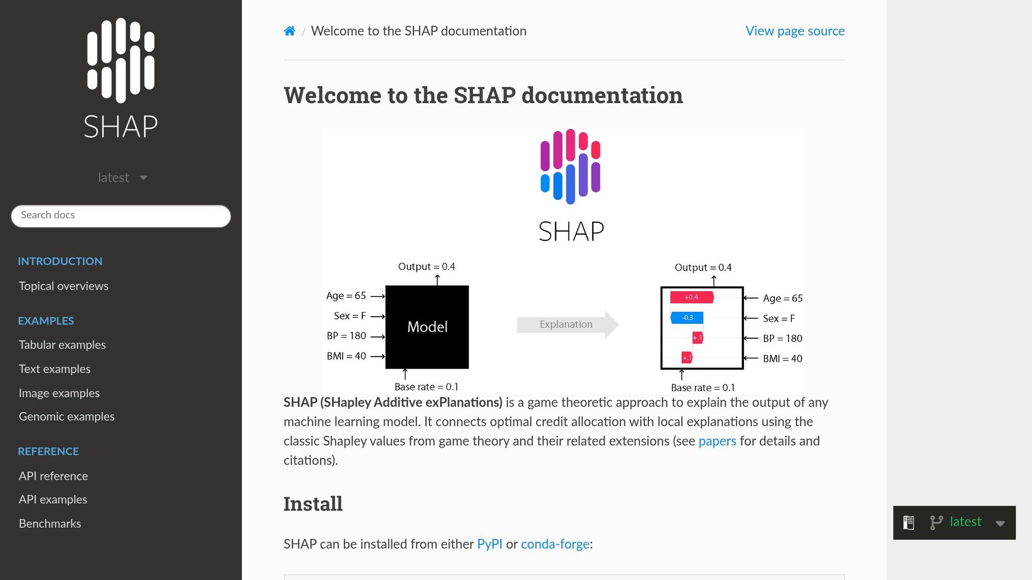
- SHAP uses Shapley values to assign part of a prediction to each feature.
- For
KernelExplainer, a background sample of about 10 to 100 rows is often enough. - Bar plots rank average feature impact.
- Beeswarm plots show impact, direction, and spread.
- Dependence plots help me spot non-linear behavior and feature interaction.
- Waterfall plots and force plots break down a single prediction step by step.
- SHAP can also help with drift checks by tracking how feature attribution changes over time.
Beyond the Black Box: Interpreting ML models with SHAP
sbb-itb-61a6e59
Quick Comparison
| Topic | Main Point | What I’d Use It For |
|---|---|---|
| AutoML metrics | Show model performance | Accuracy, AUC, RMSE checks |
| Global SHAP | Shows top feature impact across many rows | Model review, debugging |
| Local SHAP | Shows why one prediction happened | Case review, audit support |
TreeExplainer |
Best fit for tree-based models | Fast SHAP on XGBoost, LightGBM, CatBoost, RF |
KernelExplainer |
Works for black-box models | SVM, KNN, MLP, stacked models |
| Waterfall plot | Step-by-step feature contribution | Technical review |
| Force plot | Compact single-case view | Dashboards, UI review |
| Built-in feature importance | Training-time signal | Fast first pass |
| SHAP | Prediction-time contribution | Deeper model explanation |
What I take from this article is simple: SHAP turns AutoML output into something I can inspect, question, and explain in plain English - as long as I use the right explainer, test on held-out data, and avoid treating feature attribution like proof of causation.
Prepare Your AutoML Model for SHAP
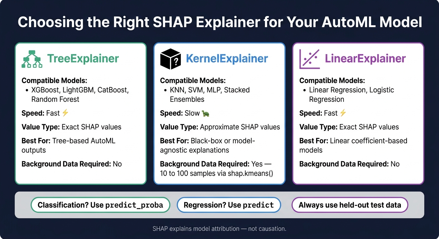
SHAP Explainers for AutoML Models: Quick Reference Guide
Before you generate SHAP values, make sure you have three things in place: the trained pipeline artifact, a representative evaluation sample, and an explainer that fits the model class.
Choose the Model and Evaluation Sample
Start by loading the trained pipeline artifact. If MLflow logged the run, pull the exact model by its Run ID.
For SHAP, use a held-out test set or validation set instead of the training data. That helps your explanations reflect how the model acts on unseen data, not just data it already saw during training. After that, pair the model type with the right SHAP explainer.
Match the Model to the Right SHAP Explainer
The right explainer depends on what your AutoML run produced.
| Model Type | Recommended Explainer | Notes |
|---|---|---|
| XGBoost, LightGBM, CatBoost | TreeExplainer |
High performance; exact values |
| Random Forest | TreeExplainer |
Optimized for tree ensembles |
| KNN, SVM, MLP, stacked ensembles | KernelExplainer |
Model-agnostic; requires background data |
| Linear/Logistic Regression | LinearExplainer |
Optimized for linear coefficients |
Use TreeExplainer for tree-based models. If you're working with a black-box model, switch to KernelExplainer.
For KernelExplainer, summarize the background data with shap.kmeans(X, k). In most cases, a small representative set of 10 to 100 samples does the job. Once you've picked the explainer, load the model and wire up the prediction function SHAP will call.
Set Up Python and Model Wrappers
Load the trained model and feature matrix X. If you're using KernelExplainer, pass the model's prediction function into SHAP and check that the model exposes predict or predict_proba, depending on what you need.
A simple rule of thumb:
- For classification, use
predict_probaso SHAP explains class probabilities. - For regression, use
predict. - For binary classification, read the positive-class probability.
With the model and explainer in place, you're ready to move on to summary plots and read global feature impact.
Read Global SHAP Patterns Across the AutoML Model
With the explainer ready, step back and look at the model from a global view. Global SHAP analysis answers a simple question: across your evaluation sample, which features influence predictions the most? Use that big-picture view to decide which features are worth a closer local look.
Use Summary and Bar Plots to Rank Feature Impact
SHAP ranks global impact by calculating the mean absolute SHAP value for each feature across your evaluation sample. Features with larger values have a bigger overall effect on predictions, whether they push the prediction up or down.
Use shap.summary_plot(plot_type="bar") when you need a clean ranked list for stakeholders. It’s the easiest way to show which features matter most.
For a deeper read, switch to shap.summary_plot(plot_type="dot") for a beeswarm plot. Each dot stands for one sample. Red dots show high feature values, blue dots show low ones, and the horizontal position shows whether that value pushes the prediction higher or lower.
Use the bar plot for ranking. Use the dot plot when you need to see spread, direction, and outliers.
Use Dependence Plots to Inspect Feature Patterns
Once you know which features rank near the top, dependence plots help you see how each one behaves across its range. The x-axis shows feature values. The y-axis shows SHAP impact. That makes it easier to spot non-linear patterns that a plain importance score can miss.
You can also color the points by a second feature to look for interactions. If the SHAP values for the main feature spread vertically by color, that’s a sign of interaction between those features. Use shap.dependence_plot to inspect key variables and check whether the model learned relationships that make sense across the full feature range.
After you rank the top features, check whether those patterns hold up across individual cases.
Compare SHAP with the Importance Scores Produced by Your AutoML Run
SHAP isn’t the only way to measure feature importance. It helps to compare SHAP with the importance scores your AutoML run already reports. A good approach is to use SHAP as the main interpretation layer, then line it up against the scores from your AutoML tool.
| Method | Local or Global | Handles Correlated Features Well | Compute Cost | Best Use Case |
|---|---|---|---|---|
| SHAP Mean Absolute Values | Both | Yes (distributes credit among correlated features) | High | Consistent, model-agnostic ranking and individual explanation |
| AutoML Built-in Importance | Global | Varies | Low | Quick initial screening during training |
| Permutation Importance | Global | No | Medium | Measuring the drop in overall model performance |
AutoML built-in importance, such as Gini importance for Random Forests or Gain for XGBoost, reflects how much a feature helped the model split data during training. SHAP measures how much each feature shifts the final prediction away from the average prediction. If the rankings don’t match, the built-in score may be showing training-time split value, while SHAP is showing prediction impact.
Explain Individual AutoML Predictions with SHAP
Once you’ve looked at the big-picture trends, the next step is to explain one prediction at a time. Global SHAP plots show how the model behaves on average. But if you need to explain why this one record got this result, you need a local explanation.
Read Force Plots and Waterfall Plots
Both plot types start with the base value, which is the model’s average prediction across the training data. From there, each feature pushes the prediction up or down for a single record. Add those feature contributions to the base value, and you get the final prediction.
A waterfall plot shows that path one step at a time. It starts at the base value, then adds each feature’s contribution in sequence, so you can see what pushed the prediction higher, what pulled it lower, and how the model arrived at the final output.
A force plot shows the same idea in a tighter visual. Features that push the prediction up appear in red. Features that push it down appear in blue. The combined effect lands on the final prediction.
For classification models, there’s one catch: SHAP may return log-odds instead of probabilities. When that happens, use the model’s link function to convert the output into probabilities.
Turn Local Explanations into Business Reasoning
SHAP starts to click for non-technical stakeholders when you turn feature contributions into plain English tied to the decision at hand. For example:
"Credit score lowered the risk score, while a recent late payment and low income raised it above the approval threshold."
That kind of explanation is much easier to act on than a chart alone.
There’s also an important line not to cross. SHAP values describe model contributions, not causes. So this is fine:
"Debt-to-income raised the predicted risk score by 15 points"
But this is not:
"Debt load caused the denial"
That distinction matters, especially in high-stakes settings.
Choose the Right Local Explanation Format
Use the table below to pick the format that fits the audience.
| View | Best For | Technical Depth | Stakeholder Readability | Typical AutoML Workflow Fit |
|---|---|---|---|---|
| Waterfall Plot | Detailed step-by-step breakdown of a single prediction | High | Medium | Model review and technical debugging |
| Force Plot | Visualizing the tug-of-war between features for a single prediction | Medium | High | Interactive dashboards and UI-based model review |
| Local Bar Chart | Simple ranking of feature impact for one record | Low | High | Quick summaries for non-technical users |
| Textual Summary | Plain-language business reasoning | Very Low | Highest | Executive summaries and automated customer-facing explanations |
In regulated fields like finance or healthcare, waterfall plots are often the better choice because they provide a clear audit trail for one prediction. For executives or customer-facing output, a short textual summary usually works best.
Limitations, Production Use, and Conclusion
Common SHAP Mistakes in AutoML Pipelines
Before SHAP shapes a production decision, it helps to slow down and check where things can go sideways. SHAP is useful, but it can point teams in the wrong direction when the wrong explainer is used, when correlated features split credit, or when model attribution gets mistaken for cause-and-effect. One of the biggest trouble spots is correlated features. If two features carry similar signal, SHAP often divides credit between them, which can make both seem less important than they are.
| Pitfall | Cause | Impact on Interpretation | Mitigation |
|---|---|---|---|
| High Compute Cost | Using KernelExplainer on large datasets or complex models |
Slows AutoML pipelines and pushes teams toward smaller, less representative samples | Use TreeExplainer for tree models; summarize background data with k-means for KernelExplainer |
| Correlated Features | Collinear features sharing predictive information | SHAP splits credit across overlapping features | Check for collinearity before training; use dependence plots to separate overlap from interaction |
| Causal Misinterpretation | Treating attribution as proof of cause-and-effect | Leads to incorrect business decisions based on correlations | Treat SHAP as attribution, not causation |
| Biased Training Data | Model trained on historically biased datasets | SHAP will accurately explain a biased model, which can make unfair decisions look justified | Audit data quality before AutoML; pair SHAP with bias checks |
A simple way to think about it: SHAP tells you how the model assigned credit. It does not tell you whether that credit reflects the world in a cause-and-effect sense. That distinction matters more than people think.
Use SHAP in Monitoring and AI Engineering Workflows
Once a model is explained, the next job is watching whether those explanations drift. Track SHAP summaries over time to catch attribution drift, which happens when the features driving predictions change even if accuracy still looks stable. That can be an early sign that the data distribution has shifted underneath the model.
The same global and local SHAP outputs used during review can also be logged on a continuing basis for drift detection. In practice, this gives teams a way to monitor not just how well a model performs, but how it is making decisions.
Databricks AutoML can automatically log SHAP explainability plots with MLflow autolog during training runs.
Conclusion: A Practical Workflow for Interpreting AutoML with SHAP
After setup, interpretation, and monitoring, the last step is using SHAP with clear guardrails. The workflow is straightforward: match the explainer to the model, review global and local plots, and write down the limits before SHAP shapes any production call. It also helps to compare SHAP rankings with other feature-importance methods to check whether the results line up.
Before any SHAP-based explanation is used in production, document:
- correlated features
- data quality gaps
- compute constraints
Do not ask SHAP to explain causation. It explains how the model makes decisions, not why the world behaves the way it does. Within that boundary, it remains one of the most practical tools for making AutoML outputs more trustworthy and easier to audit.
FAQs
How do I pick the right SHAP explainer?
Pick the SHAP explainer that matches your model. SHAP has model-specific explainers that tend to run better, plus model-agnostic options that work across many model types.
If you're working with tree-based models like XGBoost, LightGBM, or CatBoost, use TreeExplainer. If you're using another kind of model, or you want one approach that works almost anywhere, use KernelExplainer. It can work with any model, usually by relying on a summary of the training data.
Why should I explain probabilities instead of class labels?
Explaining probabilities instead of only final class labels gives a clearer look at how a model reaches a prediction. A class label shows the end result. A probability shows how confident the model is.
That extra detail matters. It shows how different features push the probability up or down, which helps you measure each feature’s effect. It also makes the model easier to inspect, explain, and trust.
How can I tell if SHAP results are misleading?
Compare SHAP findings with what you already know about the problem and the dataset. AutoML often leans toward prediction quality, so it’s worth pausing to ask a simple question: do the feature effects actually make sense?
Look at SHAP charts for both the big picture and single predictions. In particular, waterfall plots can show how each feature pushes an individual prediction up or down. That makes it easier to spot odd behavior, like a feature having a strong effect where you wouldn’t expect one.
It also helps to compare SHAP with other feature importance methods. If the same features keep showing up in similar ways, that’s a good sign. If the story changes a lot from one method to another, be careful.
When the explanations don’t line up with your domain knowledge or with other importance measures, treat the output cautiously. A model can score well and still give reasons that don’t pass the smell test.